
You know you need a website — or maybe you need a website redesign — but you run screaming at the words HTML, CSS, and Java. They’re not really English words, after all. They’re the names of entirely different languages that look like alphabet soup to the uninitiated. Well, relax. Because the website design principles covered here have nothing to do with coding.
These guidelines will help you get the most out of whatever website builder tool you use. They’ll direct you toward the best templates, images, and rules to remember.
This article covers:
- Visual hierarchy
- Gutenberg, Z, and F layouts
- The golden ratio
- The rule of thirds
- Color theory
- Gestalt theory
- Negative space and minimalism
- Mobile-optimized design
Whether you want to create a personal website that develops your brand or you want a refresher in website design for small businesses, keep these principles in mind.
Visual hierarchy
Visual hierarchy is the relative importance that the viewer assigns to a visually differentiated set of objects.
That’s a fancy way of saying that when you look at a bunch of stuff, you tend to focus on things that stand out. You pay more attention to prominent objects.
How does this play out? Well, if you view a group of images of various sizes, you’re going to naturally assign importance to bigger pictures over smaller ones. If you look at a bunch of words that are black and one written in magenta, you’ll gravitate toward the magenta word.
You can play with several different elements to establish visual hierarchy and draw the viewer’s attention where you want it. These include:
- Size and scale. Relative size matters, but so does scale. If something is clearly bigger or smaller than it “should” be, you’ll notice it.
- Focus. Out-of-focus pictures and fonts feel farther away than sharply focused ones.
- Color. Changes in color, shade, or intensity can all draw the eye.
- Typeface. Size of text, font, and effects help you to rank information on a page.
- Movement. If one image bounces into an otherwise static page, you’ll notice the one that moves — but be careful. Too much movement can be disorienting.
- Negative space. You can isolate key elements to make them stand out from more populated areas of the page.
You’ll notice that many of these website design principles start from an intuitive place. Take advantage of visual hierarchy by highlighting important information and visuals.

Gutenberg, Z, and F layouts
Organization is another way to establish hierarchy. You can tap into natural viewing habits to place your most important information and opportunities — such as the email sign-up forms crucial to ecommerce marketing strategy — where browsers are likely to pause.
The three most commonly used layouts are the Gutenberg layout, the Z layout, and the F layout. Each makes use of distinct website design principles.
The Gutenberg layout
The simplest of the three can be very effective when used correctly. The Gutenberg layout divides the page into four quadrants. Because you read left to right and top to bottom, it assigns relative importance to each quadrant respectively.
The most important information should be placed in the top left and bottom right quadrants. Material of middling importance belongs in the top right quadrant. The bottom left should only house information and images that can be quickly scanned or ignored altogether.
Z layout
The Z layout works best for minimalist pages that don’t need to present a ton of information. It takes advantage of the same general reading practices, but it draws a different pattern through them.
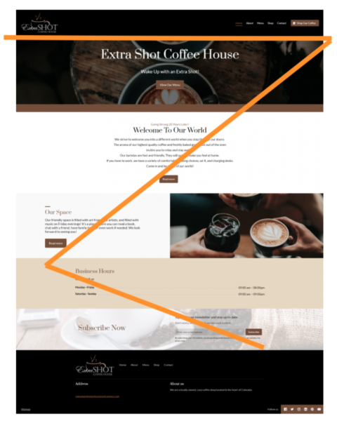
The viewer scans horizontally (left to right) along the top of the page, cuts diagonally from the top right to the bottom left, and then moves horizontally to the bottom right.
In the Z layout, you place material at each of the four corners and in the center of the diagonal.
F layout
The F layout works better when you want to include more — more everything, but especially more text.
When you’re scanning a longer, more heavily populated page, you’re going to scan left to right and top to bottom. Information should be organized symmetrically, along horizontal lines.

The golden ratio
Good website design principles can also help you determine proportions for each section of a web page. The golden ratio — sometimes called the divine proportions or referred to by the Greek letter phi — refers to a ratio that people naturally find visually appealing or even beautiful.
It occurs when you have a line segment divided into two fragments of different sizes. The ratio of the bigger fragment to the whole equals the ratio of the smaller fragment to the bigger one.
But there’s no need to try to scrounge up what you remember about quadratic equations from the seventh grade. All you need to remember is the number 1.618 (and really, 1.6 will do).
If you have a total area X, and you want to know how big your larger half should be, just divide X by 1.618. Easy peasy.
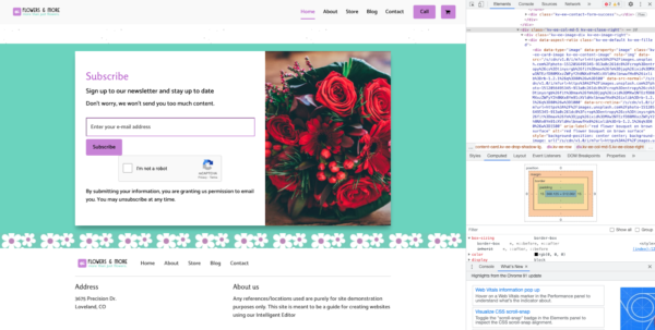
Quick tip: If you’re trying to figure out how big an image is, you can right-click (Windows) or control-click (Mac) on it and select “Inspect.” To the right of the page, you can get a lot of information about the picture, including its size in pixels under “Computed.”
The rule of thirds
It’s time to look at website design principles for the images themselves. You’ve already learned where to put them and what size they should be. The rule of thirds is a simple rule for photo composition.
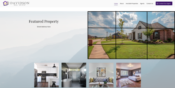
If you divide your image into three equal sections vertically and three equal sections horizontally, you create a grid. According to the rule of thirds, you would want to place visual stimuli along these lines and/or at their points of intersection.
Just as you’re programmed to find the golden ratio beautiful, you’re programmed to find pictures that use the rule of thirds dynamic and interesting.
Color theory
Color theory can be overwhelming because there are so many ways to get it right — to have a cohesive color scheme that conveys the right impression. It’s one of those topics that you can explore in much greater depth.
For this beginner’s overview, you might want to have a color wheel handy.
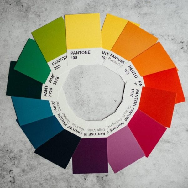
Here are four different ways to pick brand and website colors that harmonize:
- Go monochromatic. It doesn’t have to be dull. Use a variety of shades and tints to create contrast.
- Go complementary. Match your primary color with an accent drawn from its polar opposite on the color wheel — purple and yellow, for example.
- Go analogous. Pick three colors that lie next to one another on the color wheel.
- Go triadic. Draw an equilateral triangle — one with three equal sides — in your color wheel, and use the colors you find at the three points.
As you’re picking colors, you should also think about their warmth. Cool colors have more blue in them — they can come across as stark or sad, but they’re also soothing. Warm colors have more red and yellow — they can feel passionate and exciting but can also come across as aggressive in certain uses.
Gestalt theory
Gestalt theory was actually developed by psychologists as a framework for understanding cognitive processing.
At its core, gestalt theory says that when you look at a complex set of visuals, you do one of two things:
- See a coherent whole first and then see its parts
- See a confusing whole first and then try to break it down into simpler parts or groups
There are seven website design principles drawn from that base theory:
- The law of similarity. Group things by likeness. Similar things go together.
- The law of proximity. Group things according to common regions or relative distance between them. Things that are close together belong together.
- The law of simplicity. People see ambiguous objects in the simplest terms possible. For example, you’ll perceive overlapping circles as just that — rather than as a collection of arcs.
- The law of continuity. People are more likely to see things as continuous than as separate. You’ll follow objects along paths or curves.
- The law of perception. People see figures — or focal points — and backgrounds. Things stand in relation to other things.
- The law of closure. People fill in missing information to make sense of things. A broken line is still a line.
- The law of symmetry. People see symmetrical things as being related.
Use these principles to help your viewers interpret the information you give them.
Negative space and minimalism
These two belong together because both are anti-clutter website design principles.
Negative space is all the white — or otherwise blank — space that keeps your website looking clean and elegant. Don’t overwhelm the viewer with visual stimuli. Make sure that you have lots of white to space things out.
You also don’t want to overwhelm the viewer with too much information or too many choices. Less is most definitely more — embrace minimalism.
When you give too much information, the important items get lost. When you give too many commands or options, the visitor is less likely to pick any, bouncing away from your site instead.

Mobile-optimized design
One of the most important website design principles is to make sure your site is attractive and user-friendly on all devices.
Don’t force visitors to try and drag their way around the same static page they’d get at their desktop. Use tools that readily adapt websites for mobile users with easy-to-scroll interfaces.
Not only does this prevent visitor frustration, but it’s also an important search engine optimization (SEO) factor. Google’s algorithm definitely takes mobile optimization into account.
If you’re looking to reach new customers organically, you need a solid SEO strategy. So pay attention to the website design principles that will put you on the right track.
Website design principles — you can do it!
In fact, once you get going, it’s a lot of fun. It’s the perfect marriage of smart business strategy and arts and crafts playtime.
You’ve got lots of helpful website design principles to help you craft the perfect site, but the most important takeaways are these:
- Visual hierarchy helps you draw the viewer’s attention where you want it.
- Less is more.
- Mobile-friendly isn’t enough anymore. You need to be mobile-optimized.
So hop to it! No more protests that you’re not a website designer. You soon can and will be. Just get started.


