We’re here to help you grow.
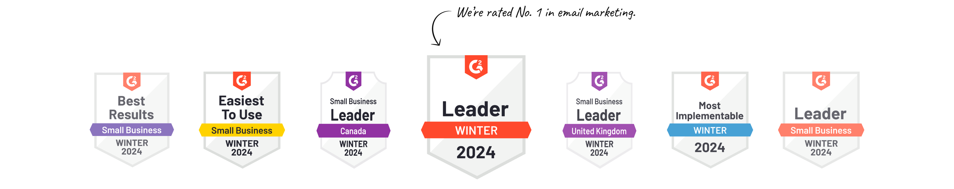
Drive revenue and boost your business with our easy-to-use email marketing tools and award-winning customer support.
How experienced are you with digital marketing?

Just starting out
Get the basics you need to turn ideas into email campaigns in just a few clicks.

Up and running
Unlock new possibilities and turn visitors into devoted fans with the perfect set of tools.

Savvy marketer
Take your business to the next level with robust campaigns that do the work for you.
Turn your website into an email in 3 easy steps.
Easily transform your logo, images, colors, and messaging into a captivating email using our design studio.
Tools to help you reach your goals.

Social Media Marketing
Schedule posts, create ads and more for all your accounts, all in one place.
Marketing Automation
Develop customer relationships with advanced marketing automation tools.
Well-written campaigns in just a few clicks.
Need great copy? We’ve got you covered. With just an idea - and the help of AI - instantly turn your thoughts into emails, websites, social posts, and more.
Get startedWe love our customers. And they love us.


Get big results for your small business.