
Page Elements
Create the shell for your page by determining its url, header, footer, etc.

Page
Build a page using this component. Add any design components available to it.

SEO
Set Search Engine signals through meta data (title, description, image, schema, sitemap). Set Optimizely Project IDs.

Banner
Displays at the top of the screen above the Header. Visible to all who visit the page.

Site Header
Choose from pre-built headers: Full Site links (US/CA or International), Landing Page (no site links), Logo Only.

Footer
Choose from pre-built footers: Full Site links (US/CA or International) or Legal links. No customization please.

Chat
Wanna chat? Sales has reps versed in BAU, International, and Partner. Simply add the appropriate pre-built chat.
Hero Elements
Choose a Hero option and make it unique through content selections.

Hero
Our Hero component allows hero content along with options of hosting Image, Full Image Card or Forms on right side.

Centered CTA
Versatile. One column wide with centered text and a CTA with content below it. Can be used as a hero.
Section Elements
Select the appropriate building blocks for the body of your page.

Accordion
A great way to include a lot of information in a small space. Can be text only, or add a single image on the side.

Breadcrumb
A navigation element that sits below the Header in the Hero. Helps users to find their way back, and great for SEO too.

Card
Cards run 3 across and have a choice of background color and image/no image.

Carousel
Carousels are set up with an image, headline and cta button. Can show up to 4 slides.

Centered CTA
Versatile. One column wide with centered text and a CTA with content below it. Can be used as a hero.

Checkbox Text Wrapper
No standard bullet points are used on our site! Use this component to get the fancy green checkmark icons.

Contact Information
Just like a business listing. Use this component to describe how to contact you.

Dynamic Feature Block
A fancy carousel option. Shows content that teases a click to see more. Use with or without a cta or image(s).

Dynamic Feature Block - Dropdown
Need a dropdown/picklist? This one allows you to set both the picklist AND its associated content.

Full Image Card
Use this component to wrap multiple cards with overlay. The cards run 3 across.

Icon
This component lets you add icon to any media blocks.

Image
This component lets you host different breakpoint images like desktop/tablet/mobile.

Logo
Want to show who partner with us? Use this component to host their logos.

Media Block
Runs up to four across. Choose whether to use an icon, include a cta, or even display attribution across the bottom.

Modal
Modals allow you to show more information on click without leaving the page. There are constraints on modal content.

One Column Text Block
Run left-aligned copy across the page. Options include a heading, cool animated image and content below.

ROI Calculator
A pre-built modal for the Pro ROI calculator that can be included on your page.
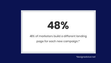
Stat Card
An attention-grabbing way to show stats. Includes a field for attribution below.

Sub Features
Want to display all features of email marketing? Use this component to link to all the feature pages.

Tabs
Fun component to switch between different options!

Two Column Block
You can display content and image with different options like switch image to left/right and full width/contained.

Two Column Text Block
This component lets you display content side by side with width percentage 40/60 or 50/50.
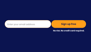
Two-Step Signup Form
Use this component as a first step to lead new customer to Signups!

Video
Use this component to host a wistia video.
Additional elements

Redirects - Distinct - www
Need to redirect a www page or set a vanity url? Set redirect type: 301 (permanent) or 302 (temporary).

Redirects - Distinct - go
Redirect a go. url. Set source & destination urls & redirect type: 301 (permanent) or 302 (temporary). No vanity urls.
CTA button options:
CTAs can also be set side by side (and use an image):

