


Accordion, Accordion Wrapper
Accordion 1 - Content tiny mce
component-library - Checkbox Text, no image selected, default is green checkmark

component-library - Buy Flow - Plus - checkbox text
component-library Buy Flow - Email - checkbox text

component-library - Buy Flow - Core - checkbox text

component-library - Buy Flow - Select - checkbox text
Accordion 2 Content tiny mce
Accordion 3 Content tiny mce
After Hours Chat
After Hours Chat doesn't render anything currently. This component needs to be deprecated
Attribution
Attribution - Content text with default background color. Text Highlight
Branded Template Builder Entry
Intro Text: Branded Template Builder
Headline: Meet your match.
Sub-Headline: Enter your website or Facebook URL below and we’ll make an email template to match your brand.
Hero - Breadcrumb - Intro Text. required
Hero - Breadcrumb - Headline, required
Breadcrumb component is a sub-component of the Hero component.

Buy Flow, Buy Flow Plan
Buy Flow Progression Steps
Buy Flow Progression Steps are a sub component that are 'embedded' via the Contentful Rich Text Block
Buy Flow Progression Step 1:
- Create your account.
- Confirm your selection.
- Review and complete your order.
Buy Flow Progression Step 2:
- Create your account.
- Confirm your selection.
- Review and complete your order.
Buy Flow Progression Step 3:
- Create your account.
- Confirm your selection.
- Review and complete your order.
Card, Card Wrapper
Centered CTA
Centered CTA: Section Intro
Centered CTA: Headline
Chat
(this component not available to render)
Chat is implemented as a sub-component of the Page component
Checkbox Text, Checkbox Wrapper
component-library - Checkbox Text, no image selected, default is green checkmark
component-library - Buy Flow - Plus - checkbox text
component-library Buy Flow - Email - checkbox text
component-library - Buy Flow - Core - checkbox text
component-library - Buy Flow - Select - checkbox text
Column Wrapper
Column Wrapper: Intro Text
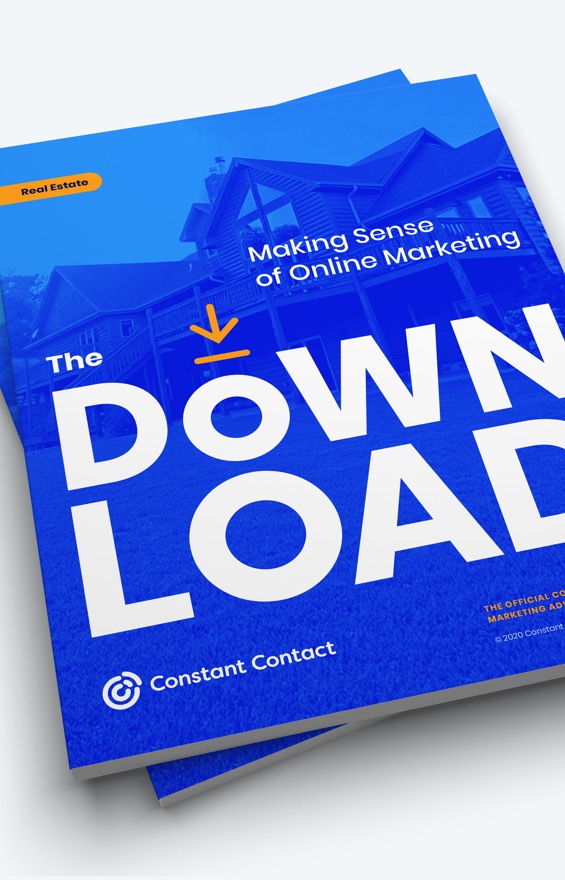
Online marketing simplified - what you need to know.
Online marketing presents opportunities to build your brand, get more leads, and ultimately close more deals, but with so many tools it can be hard to know what's worth your time and how to use the tools.
That’s why we’ve created The Download for Real Estate, a free guide to help you have a growing and connected client base.
Outline w/Download IconPrefer videos? Watch our free on-demand webinar.
Conditional Component, Conditional Wrapper
(Condition = Hide success stories on mobile (this might mean that this component should only render for Desktop and Tablet)? And the option for the conditional is set to be based on "Cookie")
Not sure what type of "Detection" is availble to set the Cookie to meet and render the Conditional based on "Desktop" or "Tablet". It seems like the capability to "Detect" a Desktop or Tablet is not working or maybe it's not available yet?
Contact Information
One Column Text Block: Contact Information - Intro Text, centered
One Column Text Block: Contact Information - Headline
blue w white strokewhite w blue strokebluewhiteorangeoutlinetransparent
Outline w/Download IconOutline w/Right CaretOutline w/Play IconOutline w/Cart IconCTA Button


CTA Buttons with Icons
CTA Button Wrapper with CTA Button as Image
(CTA Button Wrapper used with CTA Button adds padding around the buttons)


blue w white strokewhite w blue strokebluewhiteorangeoutlinetransparent
Outline w/Download IconOutline w/Right CaretOutline w/Play IconOutline w/Cart IconCTA Button
CTA Buttons with Icons
CTA Button Wrapper with CTA Button as Image
(CTA Button Wrapper used with CTA Button adds padding around the buttons)
Dropdown With Image Option, Dropdown With Image Wrapper
This component will not render. It's either incomplete or is no longer in use and needs to be DEPRECATED
Dynamic Feature Block - Dropdown/Dropdown Option
Dynamic Feature Block Tabs, Dynamic Feature Block Wrapper
Features Grid Header, Features Grid Rows, Features Grid Wrapper
Brevo

Customer List Growth tools
Google ads integrated
Our streamlined experience automates ad setup and management so you get the most clicks for the lowest cost.
Gift card incentives integrated
Get more signups by offering a $30 gift card, which can be used at over 9,000 businesses, at no cost to you, and can be automatically accessed via a landing page or by email.
Text message sign-up
Make it easy for people to join your email list by sending a text message from their mobile device.
Facebook ads integrated
Drive new business fast with our streamlined experience that displays ads in your target customer’s Facebook feeds.
Website Sign-Up Forms
Turn your website visitors into leads by displaying a customizable form that offers an incentive to sign up like email promotions, a checklist, or a free consultation.
Lead generation landing pages
Create a custom webpage dedicated to capturing new leads and share it via social, ads, and more.
Email Marketing Features
Professionally designed, mobile-friendly templates
Choose from hundreds of customizable templates or create your own.
+300
+40
Drag and drop email editor
Create beautifully branded emails fast with drag-and-drop editing.
Check for errors
Send with confidence using a built-in email review for common mistakes like template placeholder text or missing links.
Subject line recommendations
Gain ideas and increase your open rate by using our built-in recommendations based on your email content, industry and our expertise of what works.
Automated Email Marketing
Automated Resend to Non-Openers
Increase open rates by choosing a timeframe to automatically resend an email to contacts who didn’t yet open.
Abandoned Cart Reminder
Boost sales by re-engaging customers who didn't complete a purchase.
Welcome new contacts
Nurture new contacts instantly with automated welcome emails.
Birthday & Anniversary greetings
Strengthen your relationships by automatically wishing your subscribers a happy birthday and/or anniversary.
Contact Management
Add, store, and organize contacts
Easily add, search and organize contacts; duplicates and unsubscribes are automatically managed.
Reporting
Track results in real-time & optimize
Easily know what’s working - see everything from email views, clicks, engagement with your social posts, surveys and more in every plan.
Customer Support
Live phone support
An award-winning live customer support team is readily available to help all customers in all plans.
Only available starting at $65/mo
Live chat support
Chat with a real person and quickly get the expert advice you need.
Personalized new customer kickoff call
Guidance from a marketing expert to help you get results faster.
Additional Features
Create and post to Facebook, Instagram, and/or LinkedIn at once
Our easy-to-use dashboard will automatically optimize the content and images for each platform.
Marketing calendar
Stay organized and efficient with all your marketing activities mapped in one view.
Polls
Get instant feedback from your contacts so you know more about who they are and what they want and increase engagement.
Event management
Promote your event, collect registrations 24/7, sell items, and track details—quickly and easily.
Event RSVP
Get a headcount for an event with an RSVP block.
Features Grid Pricing, Features Grid Wrapper

Plan
Core
Best for people getting started with marketing to their customer base.
$12/month
Price based on number of contacts*
View tiered pricing Core Includes:

Basic email marketing
Social marketing
Post to Facebook, Instagram and Twitter all at once
Integrations with popular tools like Shopify, WooCommerce, Canva and Etsy
Engagement reporting (i.e. views, clicks, etc)
Award-winning live chat and phone support
Plus
Best for marketers who need enhanced features to fuel more growth.
Starting at
$35/month
Price based on number of contacts*
View tiered pricing Everything in Core, plus:
List-growth tools including Google ads
Contact segmentation
Automated communications (e.g. resend to non-openers)
In-depth reporting including conversion and sales
Drag and drop products from your online store
Auto-generated customer segments for targeting
Personalized consultation to maximize your capabilities
*Plan price is based on number of contacts and email sends. Overage fees may apply. Note that you agree to the Terms & Conditions, and Mail Terms of Service and acknowledge receipt of our Privacy Notice.
Testing
*Plan price is based on number of contacts and email sends. Overage fees may apply. Note that you agree to the Terms & Conditions, and Mail Terms of Service and acknowledge receipt of our Privacy Notice.
Features Grid Selection
Features Grid Selection -> This component can be activated/added to the "Available Selections" field in the Features Grid Rows component.
Example use case: this component is used to indicate whether a feature is "Included" (renders a check) or "Not included" (renders a dash) when comparing Constant Contact to Sendinblue
Form
Headline


Accounting & Payroll
No CTA
0 / 0
Full Image With Content
Let’s get to work.
And if you’re looking to step up your game, check out our all-in-one digital marketing platform.
Hero
Intro Text: Text above Headline
Headline: Turn visitors into customers with targeted landing pages.
Reach new audiences and grow your online sales all in one place.
And I want to have a link right here. And then this one should be to open a PDF in a new window and go here in a new window.
Hero (Short with rotating text)
HTML
- The HTML component is a functional component, it does not render any viewable content.
- The HTML component is a sub-component of the Page component and is used to add Javascript or CSS overrides to a page from Contentful CMS.
Example of the HTML sub-component used to add Javascript: HTML component with Javascript <script>
Example of the HTML sub-component used to add CSS overrides: HTML component with CSS overrides <style>
Example of the HTML sub-component used with "Namespacing" method to isolate CSS overrides and a media query override for specfic component (Persona Card v2): HTML component with Namespacing CSS and @media query
Headline: The Icon component is a sub-component of Media Blocks, Media Block Wrapper component
Waltham
Headquarters 890 Winter Street, Suite 300 Waltham, MA 02451 United States
Boston
40 Water Street Boston, MA 02109 United States
Loveland
3675 Precision Drive Loveland, CO 80538 United States
Gainesville
5001 Celebration Pointe Avenue Suite 410 Gainesville, FL 32608 United States
Los Angeles
11845 W Olympic Blvd Suite 1100 W Los Angeles, CA 90064 United States
Waterloo
151 Charles Street West Suite 100 Kitchener, Ontario N2G 1H6 Canada
Brisbane
Level 6, 230 Brunswick Street Fortitude Valley, Queensland Australia
Image

Link
Link List
Click on Site Header Menu Wrapper in the Site Header to see the Link List component example.
The Link List is a sub-component used with the Site Header Menu Wrapper component.
Logo, Logo Wrapper
Logo Intro Text
Logo Headline: Add more impact to your email marketing.
Logo Paragraph Text: Unleash the power of your business—and drive more revenue—by integrating Constant Contact with the tools you’re already using.
Media Block, Media Block Wrapper
Media Block Wrapper - Intro Text
Media Block Wrapper - Headline
Media Block Wrapper - Paragraph Text: Lorem ipsum dolor sit amet?
Modal
One Column Text Block - With Image
One Column Text Block With Image: Intro Text
One Column Text Block With Image: Headline
One Column Text Block - No Image With CTA
One Column Text Block No Image With CTA: Intro Text
One Column Text Block No Image With CTA: Headline - Heading Size 1
Pill
Link text with pill
Pill doesn't seem to work when it's added to Link component that is added to a Section component. If I can add a Link to a Section and add a Pill to a Link, shouldn't it render?
However, pill is working if it's inside a Site Header Menu Wrapper or Card Component.
ROI Calculator
Section Intro: Customer Success Team
Headline: You’ve got this. You’ve got us.
Sub Content: Whether you’re an emerging brand just starting to sell online or you’re an ecommerce expert, we can set you up with Ecommerce Pro quickly to start selling more in less time.
Or call 1-877-540-1758
Rotating Headline
The Rotating Headline component is a sub-component of the Hero (short with rotating text) component.
Section with Background Color
Section component is one type of general purpose component that is used to add almost all components to a page.
This text is rendered by adding a TinyMCE Rich Text Block component to a Section component.
Small Card Carousel Item, Small Card Carousel Wrapper

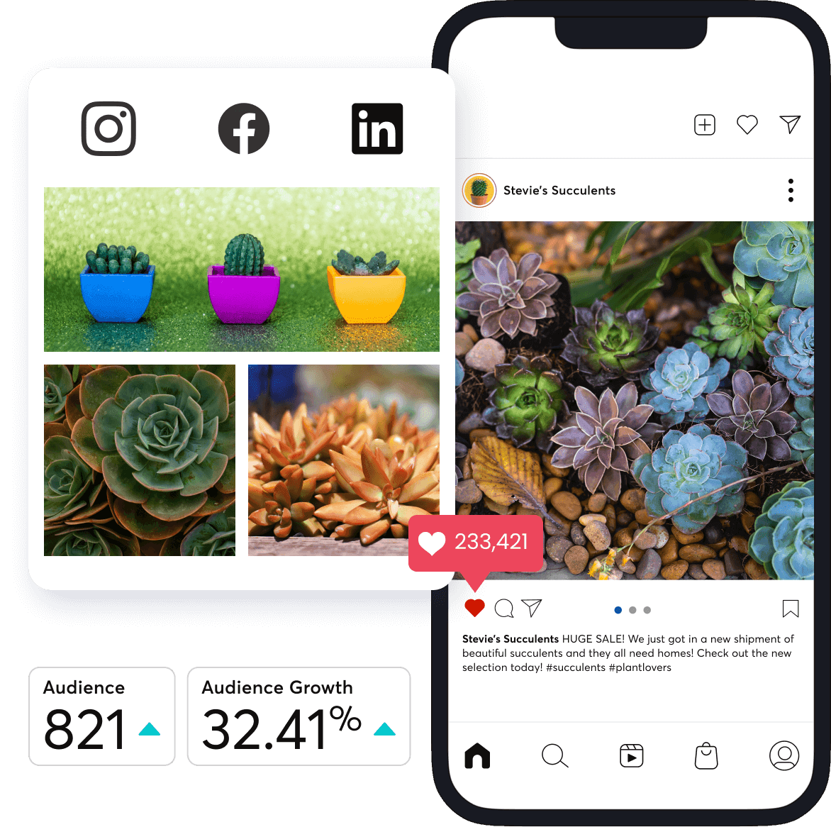
Email Marketing
Connect with people where they go every day: their inbox now.

Social Media
Get noticed on the feed and get new leads with Facebook and Instagram ads.

Email Templates
Choose from hundreds of customizable templates.

Contacts
Grow your customer list fast with landing pages, social ads, SMS, and more.
Standard Form, Standard Form Input
Stat Card, Stat Card Wrapper
300%
Targeting your pages correctly can increase conversion rates up to 300%.*
48%
48% of marketers build a different landing page for each new campaign.*
100%
100% of the time it's best to use a total of 4 stat cards for even distribution on the page
47%
47% of something results reported here
Note: *designadvisor.net
Sub Feature, Sub Features Block
Tab (generic), Tabs Wrapper (generic)
TinyMCE Rich Text Block
Heading 1
Heading 2
Heading 3
Heading 4
Heading 5
Heading 6
Preformatted
Paragraph text ... Italic text ... Link text ... lorem ipsum dolor sit amet, consectetur adipiscing elit, sed do eiusmod tempor incididunt ut labore et dolore magna aliqua. Faucibus scelerisque eleifend donec pretium vulputate sapien. Adipiscing elit pellentesque habitant morbi tristique senectus et. Convallis a cras semper auctor neque vitae tempus quam. Adipiscing tristique risus nec feugiat in fermentum.
Bold paragraph text ... mauris sit amet massa vitae tortor condimentum lacinia quis vel. Ipsum suspendisse ultrices gravida dictum fusce ut. Nisl pretium fusce id velit ut. Tempus iaculis urna id volutpat lacus laoreet.
Bold Link 1 ... Commodo elit
Bold Link 2 ... Habitant morbi tristique
Bold Link 3 ... Pellentesque diam volutpat
Vitae auctor eu augue ut lectus arcu. Dictum non consectetur a erat nam at lectus urna. Nulla facilisi etiam dignissim diam quis enim lobortis scelerisque:
- Ordered list item example ...
- Ordered list item example ...
- Ordered list item example ...
- Ordered list item example ...
- Ordered list item example ...
- Ordered list item example ...
- Ordered list item example ...
Semper eget duis at tellus at urna. In hac habitasse platea dictumst quisque sagittis. Sit amet consectetur adipiscing elit pellentesque habitant morbi tristique:
- Unordered list item example ...
- Unordered list item example ...
- Unordered list item example ...
- Unordered list item example ...
- Unordered list item example ...
- Unordered list item example ...
- Unordered list item example ...
Two Step Signup Form
Section Intro
Headline: Get digital marketing results.
Video
US Version
Switch location to see it in action
hero Iframe
Hero with Video
Hero Video SubHeading
2 column block with video text
There’s more...
Earn Constant Contact Certification
Email Marketing: Drive traffic and sales by creating, sending, and tracking campaigns.
Social Demo