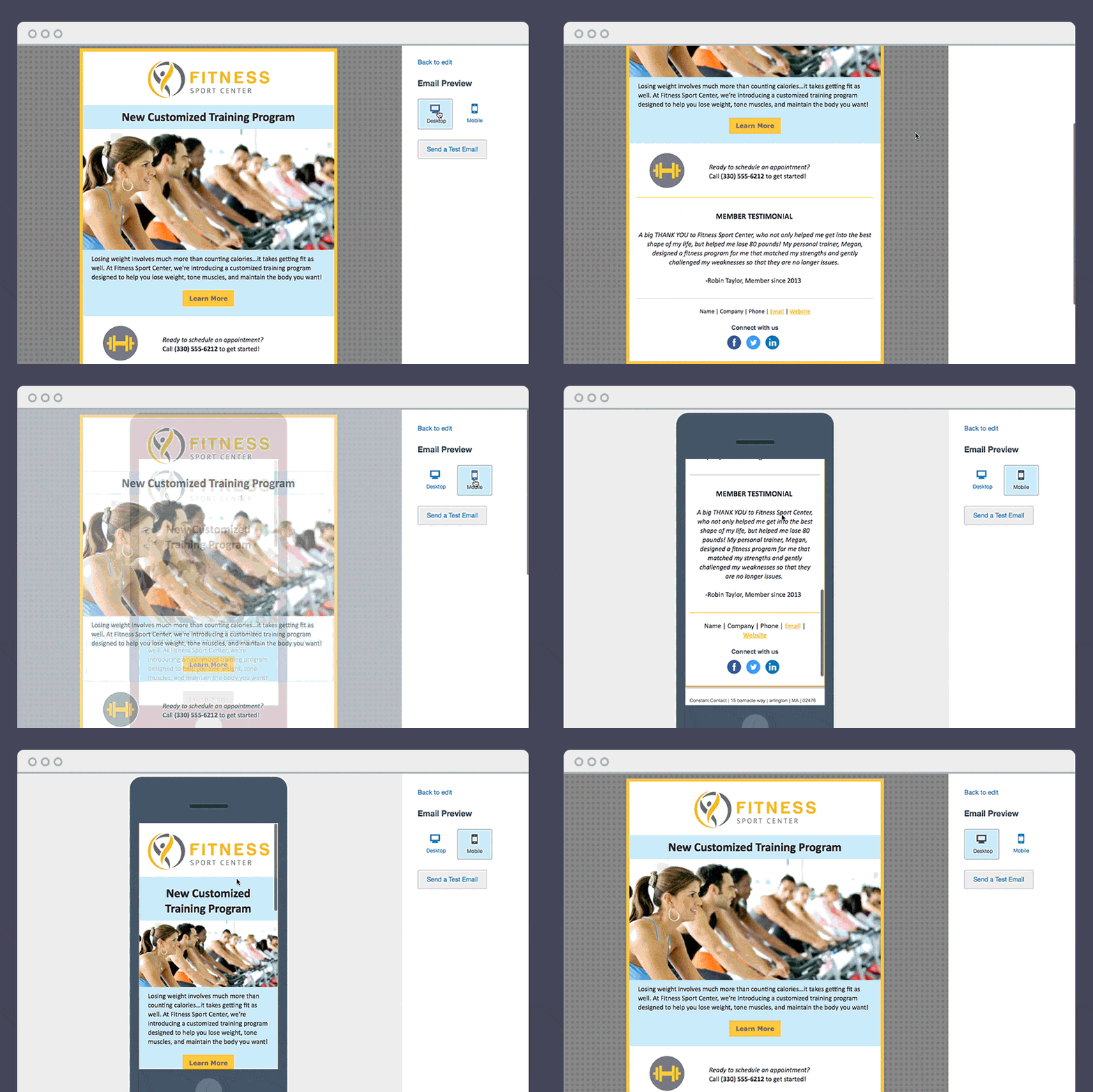
A responsive email template is a template for email marketing designed to look great and function properly across any device. A responsive template will automatically adapt to any screen size, so whether the email is opened on a smartphone, tablet, or computer, it will look great, function well, and be easy for the recipient to read.
Why is this such an important consideration for anyone conducting email marketing? Well, you know what really grinds my gears? When I open an email marketing campaign on my smartphone and have to pinch and expand to see the text. The sender is presenting me with a poor user experience, and that doesn’t sit right in the mind of a consumer.
In fact, it tells me that the sender didn’t take care in testing the email before it landed in my inbox, and that means they don’t care about my time or the quality of our interaction.
As a result, I don’t particularly care to do business with them.
In this day and age, a lot of people rely on their smartphones to check email. And since emails are one of the top ways a lot of brands interact with their clients and followers, it’s important to keep this in mind and adopt responsive email design so that your message gets across clearly regardless of device type and screen size.
Why you need a mobile-responsive email template
So, what is a responsive email template? In summary, mobile-responsive email templates automatically adapt to the size of the screen they’re being displayed on so your email looks great, has a functional layout, and is easy to read regardless of your subscriber’s screen size. In essence, whether your customer has the latest and greatest iPhone Pro, a foldable Samsung Galaxy, or a new Nokia smartphone, the email will show up properly.
And with mobile open rates having grown substantially over the past decade, looking good on mobile is essential to delivering a quality message to your customers and subscribers.
Constant Contact has made sure that every email template in their email editor tool is mobile-responsive, so you never have to worry about how your email campaigns look on desktop versus mobile. Whether you plan to send an image-heavy sales email or an email newsletter full of value-add content, it’s never been easier to make sure your email layout is optimized for every screen size across all devices.

What about your business?
You can easily see exactly how many people are opening your emails on mobile versus desktop within your Constant Contact Email Reports. Of course with the release of Apple’s Mail Privacy Protection feature in September 2021, your open rates may not be accurate, but they’ll provide you with a good estimate of mobile vs. desktop opens.
Here’s an actual example of mobile versus desktop opens from fitness studio, Turnstyle Cycle:

With an average of 56 percent of their subscribers opening their email on a mobile device, Turnstyle Cycle’s staff uses a mobile-responsive template to make sure their HTML emails always display correctly for their customers and newsletter subscribers.
Here’s what Turnstyle Cycle’s owner, Matt Juszczak, says about using a mobile-responsive email template:
“I don’t have to worry about how my email is going to look on different mobile devices. It’s a relief knowing that everything is going to work and I’m not going to have any problems.”
Want to learn more about creating and sending mobile-responsive emails?
We’ve established the importance of considering your mobile subscribers, but how do you build a mobile-responsive email template in Constant Contact? It’s quite simple actually, and we’ve put together this helpful video walkthrough with step-by-step instructions:
As a note, you can work from one of Constant Contact’s many pre-built templates, or you can start from something as basic as the “Blank Note” layout and add sections as you see fit. In designing email marketing campaigns for 15 years, I can tell you that starting from a basic layout makes it much easier to personalize the look and feel of your email template.
Did you know that you can copy your mobile-responsive email template to save time? Ready to get started? Check out the professionally-designed and easy-to-edit mobile-responsive email templates inside of Constant Contact.


