
If you’ve never created a newsletter email template, or are starting to wonder if your current newsletter needs an overhaul, this post is for you.
Whether you’re an old pro, or completely new to writing newsletters, the idea of creating a new, modern newsletter email template can be daunting.
After all, long gone are the days when a newsletter looked much like a newspaper; with section after section of detailed information. But that doesn’t mean we have any less to share with our readers.
Today’s newsletter email should be designed and written, with the intention of having its readers go outside of the newsletter for more information.
In other words, save the detailed content for your website, online form or landing page, and keep your newsletter short, to the point, and super-easy to navigate.
How exactly do we do that?
Well, this is the one time that I will tell you to start with the design, instead of the content.
How to design an email newsletter template
While most of the time, you’ll want to start your emails by thinking about the content, newsletters are a bit different.
When we’re talking about newsletters, we need to think about our readers first — as in; make a newsletter template that’s easy for your readers to scan through.
People don’t read an entire newsletter in one sitting anymore. I personally don’t know anyone who has the time. Do you?
Most of us scan through a newsletter, see if there’s anything we want to read at that moment, and then either read further or move on to something else. So, make sure your template will be easy to scan and navigate, and contains clear calls to action that will allow readers to get more information elsewhere.
Tip: Each article in your email should have its own landing page, webpage, or webpage section, with its own direct link. Don’t put all the newsletter articles on one webpage — anywhere. Individual links for each article makes your newsletter information easy to scan, easy to navigate, and easy to digest.
How to create an email newsletter template that works
There are a plethora of email newsletter templates out there, and with email providers like Constant Contact, you can create a branded email newsletter using a branded template builder, create one from scratch using a blank template, or even import custom code.

But there are a few important things to keep in mind when choosing the layout of your newsletter template:
- How many subjects/topics do you have to share with your readers at any given time? – One or two, five or six, ten or more? (We recommend that you have a maximum of three or four articles per newsletter. If you have more information to share than that, put it on a webpage and share the link, or consider sending your newsletter out more frequently).
- Do you have one subject that is the most important thing for your readers to know about? – Or, do all of your topics have about the same weight when it comes to importance?
- What tone do you want to set? – Formal, casual, professional, personal?
Examples of modern email newsletter templates
Personally, I’m a very visual person, so having some examples always helps.
So, let’s take a look at a few different newsletter layouts and break down what makes them good.
Let’s start with Orange Cycle out of Orlando, Florida.
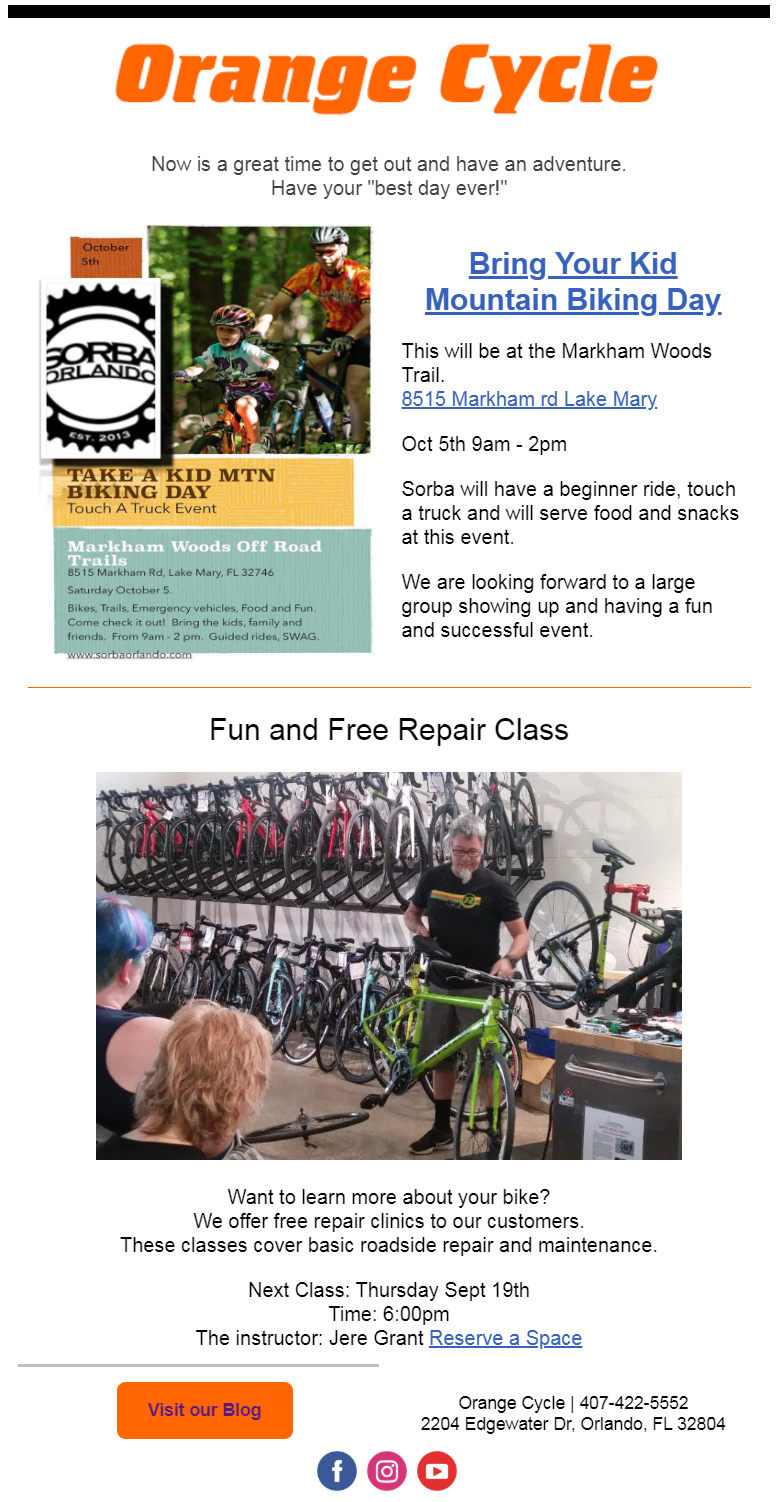
The first thing you should notice is how easy this newsletter is to navigate. Orange Cycle keeps their text short, and includes links for their readers to take further action: Images navigate to their website; hyperlinked text takes them to more information on the subject, gives directions, or allows them to “reserve a seat”; and the buttons at the bottom give readers quick links to check out their blog, or visit their social media pages.
This is exactly what a newsletter should be.
Orange Cycle keeps their newsletters down to two or three articles per newsletter. By doing so, they are able to give equal focus to a couple of highlights, make the text short and sweet, and showcase a couple of photos.
The benefits of this type of layout are:
- It’s quick and easy to create – Each month, they change the top image and information, and the second section (with ongoing classes) can stay the same.
- It’s easy for the reader to navigate – With one new topic, at the top of the newsletter, the reader can spend just a few seconds on the newsletter and know what’s new at Orange Cycle, or what events are coming up.
Things to consider with this layout are:
- Be sure that the most important information is at the top of your newsletter and stands out from the rest.
- Make sure that your images and copy match, and that you have enough copy to entice your readers to take action by clicking on a link to read more.
Tip: In this newsletter, Orange Cycle included information from an event by Sorba. Save time and energy by following their lead and source information from outside of your organization. As long as it relates to your business, and is information your readers could use, it’s worth sharing.
Let’s take a look at another email newsletter example
This is a newsletter that the Ohio Landscape Association (OLA) sends out every month to let their readers know what’s in that month’s issue of their online magazine, “The Growing Concern.”
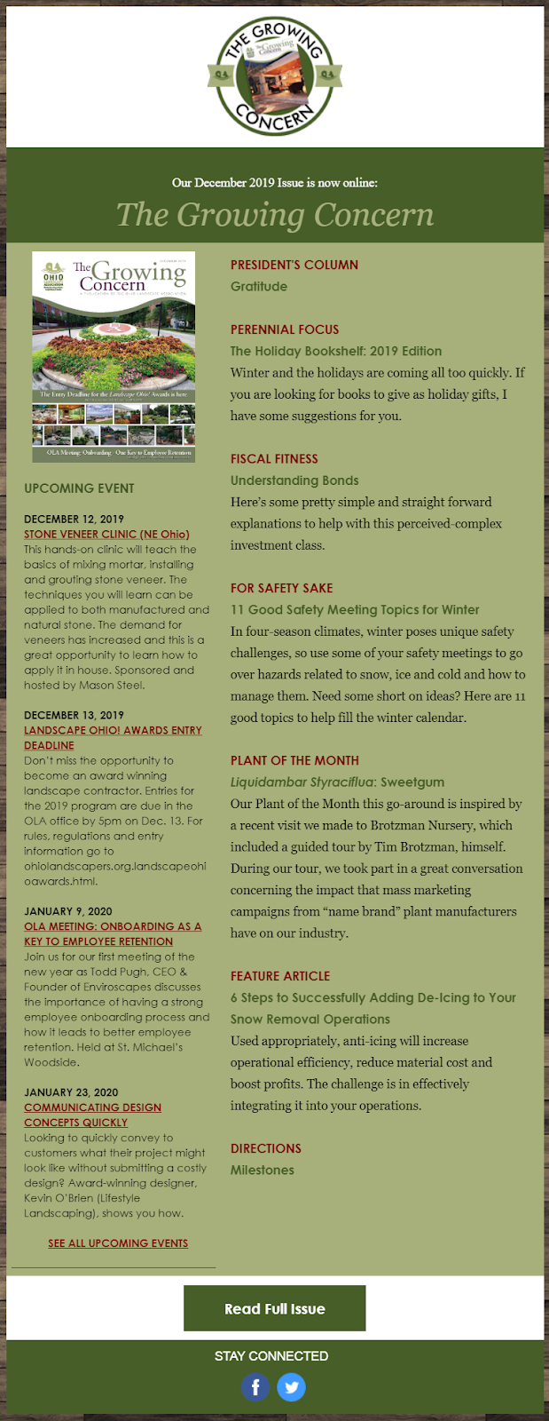
After the previous example, this one seems like it has a lot going on. And it does — but that’s because OLA is describing what’s in the latest issue of their online magazine. They really only have two articles. One is a list of dates they want to point out to their readers, and the other is the magazine itself. It may look like there are eleven topics, but it’s closer to two or even five — depending on how you look at it. Either way, there are still less than twenty lines of text (not including headers, sub-headers, linked text, and buttons).
This more traditional, two-column layout allows OLA to separate events and dates from article highlights.
The benefits of this type of layout are:
- A familiar style that lets readers know instinctively that it’s a newsletter, without having to state that it’s a newsletter.
- Important dates and events are quick and easy to find.
Things to consider with this layout are:
- Make sure that one column doesn’t end up substantially longer than the other, leaving you with too much white space on one side or the other.
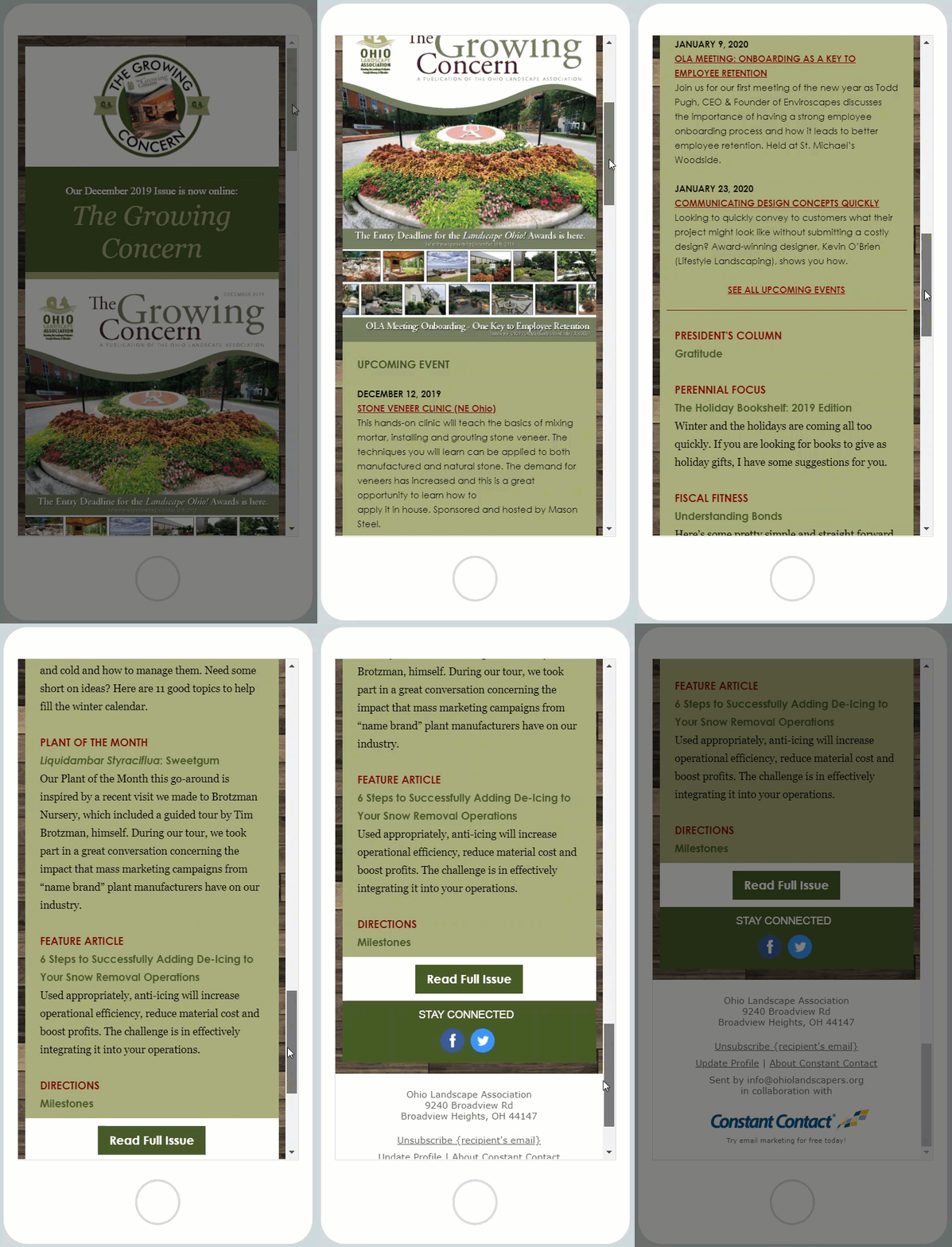
- On mobile, everything on the left will show up first, so make sure that’s what you want your readers to focus on, and that the left column will flow smoothly into the right column.
- Be careful not to make it too long, or it will seem overwhelming to the reader.
Here’s how it looks when viewed on a mobile device:
Want to pack a lot in, but don’t like the two-column layout?
Now you’re talking about getting modern!
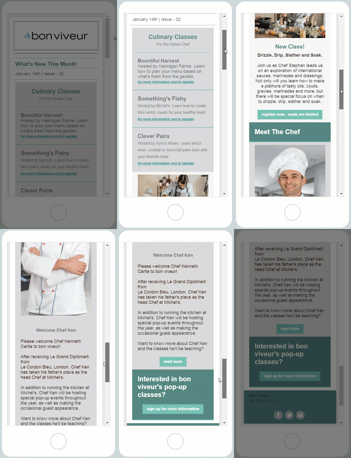
Take a look at this mock-up I did recently, using Constant Contact’s “Basic Newsletter Sidebar” template:
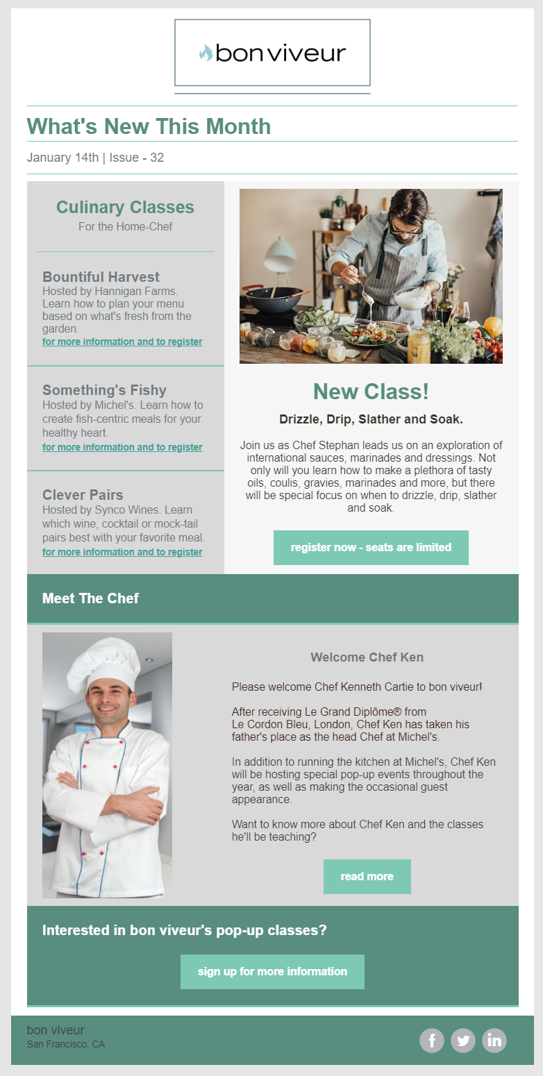
I love this particular template because it’s reminiscent of the old-school two-column layout, but with updated elements, style, and ease of reading. If you take a close look at this example, you’ll see that there’s a lot packed in (six topics), with only two images and ten lines of text (not including headlines, subheaders, hyperlinked text, and buttons; of course). Notice, however, that despite there being six topics, there are only two articles — classes and a new chef.
The benefits of this type of layout are:
- As I mentioned above, it looks like a newsletter, with the date and issue at the top; it’s reminiscent of an old-school newsletter, without looking outdated.
- It’s easy to navigate and the top articles clearly stand out.
- There are a lot of updates packed in without taking up a lot of room or being wordy — everything has a link for more information.
- It’s quick and easy to update each month — just swap out the images and a few lines of text, update the date and issue number, and it’s ready to go for the next month.
- It’s super mobile-friendly — take a look:
Things to consider with this layout are:
- You always have to make sure that the date and issue number are changed before sending each issue out.
- A section of text shows up before the first image — this is easily changed by putting a small image at the top of the left column (take another look at OLA’s newsletter to see how they did it).
What is the best newsletter template?
While I shared one of my favorites above, deciding which template and layout is the best one for you depends on you and your business.
Just like your website, you have to be happy with your newsletter template, or you’ll be tempted to change it up every month. Which is exactly what you DON’T want to do, because your readers depend on your consistency. Just like being consistent with when you send your newsletter, being consistent with the layout and style helps your readers to know what it is that you’re sending them, and helps to reduce unsubscribes and spam reports.
So, take the time to get your newsletter right the first time, and it’ll save you lots of time, energy and headaches later.
When creating a newsletter template —
Make sure you follow these simple rules:
- Make sure it’s easy to navigate.
- Tease each subject with a line or two of text.
- For each article, include a direct link to more information/to register/etc.
- Use images to expand upon your text (don’t just throw something in because your newsletter seems to need it).
And the most important advice I can give you about creating a newsletter email template is:
- Once you settle on a layout for your newsletter, and send the first one out, don’t change it. It’s alright to change the images every month (and you most definitely should), and even change up the color scheme a little for the holidays, but your newsletter should look like your newsletter, every time (we call this brand consistency). Your readers depend on it (which is why we refer to it as a newsletter template — it’s the base starting point for your newsletter, every time you produce one).
Want a template custom-made for your business? Check out Constant Contact’s Professional Services, to see what they can do for you.


