While nonprofit marketers spend a lot of time crafting great email content, it is just as important to give thought to those email’s designs.
Your message’s overall look and feel can directly impact a supporter’s decision to keep reading.
When you present your content in a way that’s both intriguing and easy to read, you have a bigger opportunity to engage readers and motivate them to take action.
Here are six design tips to help you craft great looking emails that wow readers.
1. Deliver responsive emails
With the majority of emails (66 percent) now being opened on mobile devices, it is more likely that your supporters will read and respond to your messages on their smartphone rather than on their desktop.
If you don’t send responsive emails to readers, you’re missing a large opportunity to engage your audience.
Email marketing services like Constant Contact offer well-designed responsive templates, so you can create beautiful mobile-friendly emails without any coding knowledge.
2. Use a simple layout
Aim for clean, simple design that makes your message look both professional and readable.
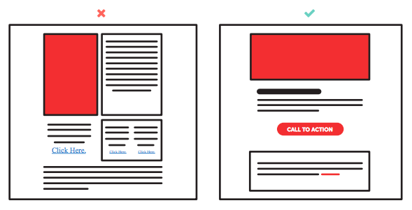
Consider using a single-column layout to create a cohesive storyline from top to bottom. This also makes your content easier to read on small screens.
Here’s an idea of an email with a single call to action and an image:

Multi-column layout versus single-column layout
Make sure you include a preheader that has your brand logo and, if applicable, a campaign hashtag.
Then, open your message with a large header image that captures your reader’s attention. Follow up with your main body text, call to action, and footer with any additional links (like your blog or contact page).
3. Use appropriate fonts
Typefaces are an important element of brand identity. Not only can they help your brand appear more professional, but consistent fonts also help readers immediately recognize your messages.
All of your communications should use brand-specific fonts and colors.
Chances are your email will be read on a variety of mobile devices, so your text should also be legible on smaller screens. Constant Contact recommends using 22pt font for headlines and at least 11pt font for body text.
4. Break up big chunks of text
Your supporters don’t have time to read a novel in their inbox. Huge blocks of text might immediately turn them off to your message.
To keep readers engaged, use compelling photos, videos, or graphics to break up your email.
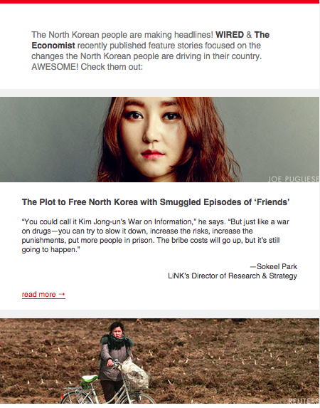
Take this example from Liberty in North Korea. They use images and text to keep readers engaged as they scroll through the email. The text tells a great story, but it doesn’t feel overwhelming. If readers want to find out more, they can click through to the full article.

5. Check your image to text ratio
A few pieces of visual content can spruce up your email, but you don’t want them to take over your entire message. Many email clients flag emails as spam if they detect too many images compared to text.
Also, make sure that your message is clear even without any visual content. Some email clients automatically block images to protect people from spam, so using an image to tell the whole story can be risky. Add “alt text” (alternative text) to your images to help recipients determine what the image is, even if it doesn’t display properly.
As a final pointer, avoid using background images in your emails. Not all email clients render background images and they can be difficult to fit for all screens.
6. Design your CTA button for clicks
Optimize your call to action (CTA) to attract eyeballs and motivate readers to click through. Create a high-contrast button that stands out from the rest of your email, so your readers know exactly what you want them to do next. Avoid clustering it with other nearby links that might distract them.
Because most people will be on their mobile devices, make sure your CTA is large enough to be touch-friendly on any screen. Apple recommends making your button at least 44 x 44 pixels.
Design your emails the right way.
Use these design principles to make your emails as visually appealing and as effective as possible.
Simple, beautiful designs won’t only wow readers, they’ll strengthen your relationship with supporters and motivate them to take action for your cause.
Find more nonprofit marketing advice here. Or ask us your questions in the comments below.
About the author: Elizabeth Chung writes about nonprofit fundraising and marketing for the Classy blog. She enjoys pastries, Wes Anderson, and watching Wes Anderson movies while eating pastries.

Is email marketing right for you?
See why smart small businesses use email marketing to drive more business. We'll show you exactly what it can do for you, and ten tips to get started.


